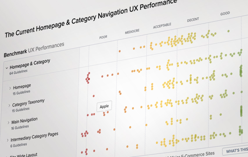
Website design, with its usability factors and functionality, can be a tricky business. There’s a lot to think about and juggle, from branding and the ‘graphic design’ side of things, to SEO, to mobile and touch device testing, to conversion rates and ‘reducing friction’. If you’re designing for a medium or large organisation you’re likely to have multiple stakeholders involved, each with their own priorities and agendas. Things can even get political. The client in-house ‘brand guardian’ will be looking in a very different way to the product marketing manager, and they’ll assess the success or failure of the site with very different criteria.
Sometimes clients and designers make the mistake of assuming that the massive, multi-million £$ household name sites will be consistently getting things RIGHT, maximising their conversions. That they have highly scientific full-time user experience (UX) teams, looking over every minute detail of each page and interaction and optimising it iteratively. Fine-tuning to perfection.
Maybe there are companies doing all of this, but the evidence suggests otherwise. For example, Christian Holst, founder of the Baymard Institute, a well regarded “independent web usability research institute” has this to say about ‘Fortune 500’ company websites:
“…you think that they have this gigantic team that just knows exactly what’s going on in every single part of their site. But when you then start to work with them it’s pretty clear that sometimes the reason why they have this particular design for their filters is because Mike decided so. Mike is somewhere in the design department. [He] decided so and nobody argued against him and that’s why they have this filtering design — not because they spend hours and hours necessarily researching every single bit of that particular design.”
So, if someone suggests doing something in a certain way “because Apple, or Microsoft, or Ikea do it this way”, have a look, yes, but don’t blindly copy something without questioning or testing it. Have a look at this article from Baymard – it has benchmarked many well-known sites over many years, and scores them on usability, navigation, layout, categorisation etc.
https://baymard.com/research/homepage-and-category-usability
There are some surprising findings in there.
That more well-known UX company The Nielsen Norman Group says similar things. See https://www.nngroup.com/articles/copying-a-famous-sites-design/, explaining that users can be surprisingly forgiving of the big brands.
“Smaller sites and lesser-known companies have to work that much harder to establish credibility.” (the implication here is that the big sites can become lazy/complacent, so why copy that?)
“On Apple’s site, users had to hunt around to find the button to purchase an iPhone. Not only was the button in an unconventional location relative to most e-commerce sites, apple.com used internally inconsistent colors and labels for its Buy buttons.
Interestingly, having a (deserved) reputation for good design came to Apple’s rescue. Users were forgiving because they knew that the iPhone had high usability, and they were sufficiently committed to spending the extra time to find out how to purchase one.”
The bigger the site, the less nimble they can be to evolve, tweak or update things. You’re probably familiar with larger sites having two or more “design views” as you work through the buying process. Sometimes the front-end pages look smart, well designed, then you hit the checkout and it feels like it’s from 2002. And that may well be the case – it’s a BIG undertaking for a busy site to completely overhaul it’s system, processes, UX, back-end connected business services, so very often the tricky bits ‘at the end’ get left for years, whilst they more regularly polish up the homepage to make it LOOK inviting and relevant (but dig a bit and you may well see evidence of very old functions still in play.)
Market comparison is always useful. It’s good to know what the competition is doing, but be aware and question everything. Look at newer ‘disruptor’ sites as well as the household names – they may be working harder and don’t have legacy software and systems to deal with.
See also https://medium.com/@seandexter1/the-baymard-institute-a-glorious-evidence-based-trove-of-ux-best-practices-189d839b1176 by Sean Dexter

